Corki: a collection of 4 free fonts

Corki is a condensed slab serif typeface suitable mostly for headlines. It's uppercase only and comes in 4 different styles: normal, rounded and their alternatives with the so called "tuscan" styled serifs 

Corki: a collection of 4 free fonts

Corki Free Font « typedepot
1980′s and 1990's Film Alphabet Poster Quiz

Can you name the movies of the 80's and 90's with just an image and the first letter?

1980′s and 1990's Film Alphabet Poster Quiz

1980′s and 1990's Film Alphabet Poster Quiz

Stephen Wildish - Design, Illustration and Art

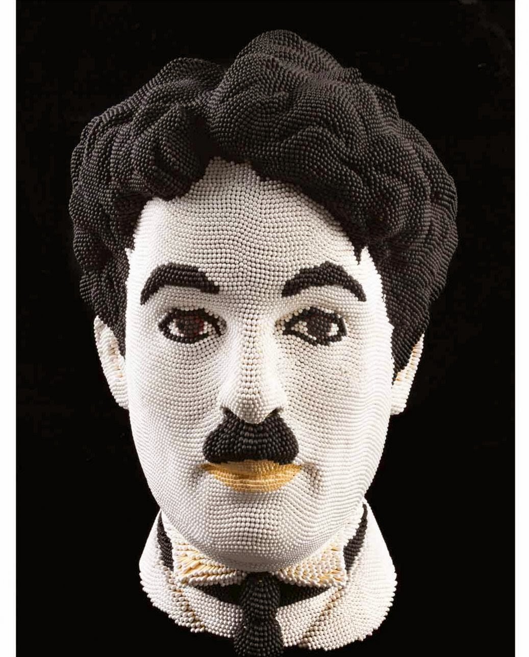
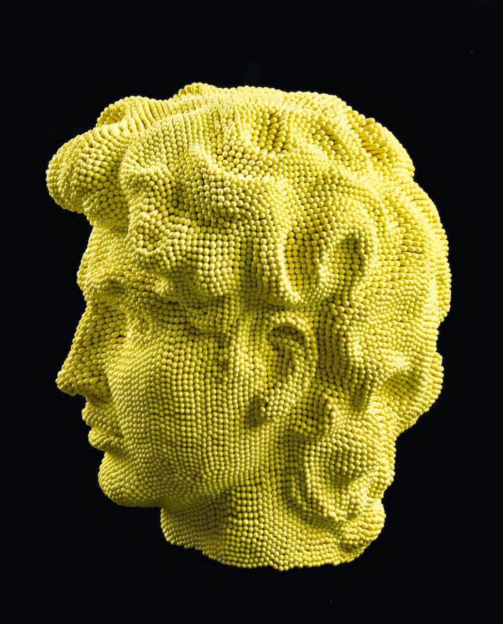
David Mach - Matchstick sculptures

UK artist David Mach uses matchsticks pressed into a clay mold to make sculptures of famous people

David Mach - Matchstick sculptures

David Mach - Matchstick sculptures

David Mach - Matchstick sculptures

Sculpture

Amazing MS Paint Skills


Amazing MS Paint Skills


Doodle MANIA with MS Paint [140x Speed]


Clean me typography

Nice dirt typography...
 
Clean me typography


New Years Greeting card for the year 2012

Kim Høltermand Photography - Brønshøj Water Tower

Some incradible photography of the Brønshøj Water Tower, a water tower in the Brønshøj district of Copenhagen, Denmark.

Kim Høltermand Photography - Brønshøj Water Tower
 
Kim Høltermand Photography - Brønshøj Water Tower 1

Kim Høltermand Photography - Brønshøj Water Tower 3

Kim Høltermand Photography - Brønshøj Water Tower

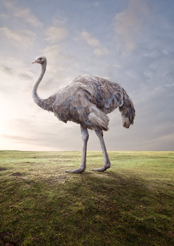
Matt Walford Photography/Photo Manipulations of Animals

Some amazing photography and photo manipulation of animals from Matt Walford...

Matt Walford Photography/Photo Manipulations of Animals 4

Matt Walford Photography/Photo Manipulations of Animals 3

Matt Walford Photography/Photo Manipulations of Animals 2

Matt Walford Photography/Photo Manipulations of Animals 1

Animal Portraits. on the Behance Network

StudioKxx Krzysztof Domaradzki Illustrations

Some amazing illustrations from Krzysztof Domaradzki, the details is insane...

StudioKxx Krzysztof Domaradzki Illustrations 1

StudioKxx Krzysztof Domaradzki Illustrations 2

StudioKxx Krzysztof Domaradzki Illustrations 3

StudioKxx Krzysztof Domaradzki Illustrations 4
 

Pin Pres Shelf

A creative shelf that adapts to the objects you put in it...

Pin Pres Shelf 1


The ingenious PinPres shelf is constructed of finely chiselled, locally forested beech wood pegs that can be arranged in any which way to fit any shelving needs—books, decorations, eyeglasses, cell phone.


Pin Pres Shelf 2

Pin Pres Shelf 3

Pin Pres Shelf 4

JWT Business Card powered by Blippar

JWT London has created a truly unique and innovative way to showcase the agency's latest showreel on the back of their business cards by using Blippar™, the first image-recognition app for smartphones targeted at brand-customer interaction.
 
JWT Business Card powered by Blippar
 
At JWT Experience team in London, we are always playing with technology. The business card has been a great platform to make our clients and prospects aware of technology through a simple, practical application. Earlier in the year we played with QR codes. Today it's image recognition and augmented reality. Next year? It looks like it may be near field communication?


Awesome Beer Label Design

From Jacksonville, Florida-based Bold City Brewery


Awesome Beer Label Design

The Kabel free font is a new contemporary display typeface

Designed by Mathias Nösel who started playing with Photoshop in 2002. Studied from 2007 to 2010 graphic and design in Munich and working until now at Serviceplan Munich, one of most successfully ad-agencies in Germany. In his free-time Mathias often working for fun projects like “The Kabel Font”.

The Kabel free font is a new contemporary display typeface

The Kabel free font is a new contemporary display typeface

http://fontfabric.com/downloadfont/Kabel.zip
The internet's first ever website and it's still live:

The first ever website

Welcome to info.cern.ch

The Best of the Best: Clients from Hell

Client: Do you do lemonade?
Me: Do we do… lemonade?
Client: Yes, I was told you do that here.
Me: I’m sorry, this is a graphics and print shop.
Client: I know that. I’m not an idiot.
Me: I’m sorry, I didn’t mean to -
Client: Look If you can’t lemonade these papers for me then I’ll go somewhere else!
Me: Do you mean… laminate?

Client: With the issue is coming out in October, could you Photoshop a sweater on those kids in bathing suits?
Me: What, with the sweater-tool?
Client: That sounds perfect! Thanks.

The Best of the Best: Clients from Hell
Me: I’m calling regarding your overdue bill. It’s 4 months over due, and you said you were going to pay it yesterday.
Client: I
don’t mean to be rude, but you’re not the only person we haven’t paid
and some of them are pastors. Do you think you’re more important than
God?

"How do I get my mobile to say my e-mails are sent from an iPhone?"

— Sent from my Blackberry Device


Me: “Alright, I want you to go ahead and drag that file to your desktop.”

Client: “Pff. I don’t have a desktop, I have a laptop!”


Client: “Can you photoshop a smile on Greg’s face. That guy is so depressing.”

Me: “Well, I think it looks just fi—”

Client:
“We’re a travel agency, we’re supposed to sell good times to people.
Greg just looks like he’s selling misery. He looks like Eeyore.”

Me: “I don’t think he looks—”

Client: “Hey Greg! Come in here! Come in here a moment!”

Greg: “What’s up?”

Client: “You’re costing me money. I have to pay this guy to photoshop a smile on your face.”


(Greg laughs awkwardly at this)

Client: “Oh, now he smiles!”


Me: “Yup, your computer is broken. Do you have another one you can use, while we take this one down to get fixed?”

Client: “My only other computer is stashed away in an aluminum box with a bunch of magnets…”

Me: “What on earth would compel you to do a thing like that!?”

Client: “Y2K was a scary, strange time for everyone, man.”


"If we crop out the fat kid, will it knock the file size down enough?"


"Move the photo about an inch to the right… or however many pixies that is. I know you only work in pixies."


Client: “I just enrolled for online banking, and now I want to withdraw money.”

Me: “Sure, you can withdraw money from one account and transfer it to another account.”

Client: “No, I want to withdraw money from my account… so I can spend it.”

Me: “Sir, your computer will not dispense cash.”

Client: “Why the hell do you call it online banking then?”


Client: “So, the website is fine and all, but this ad in the side bar is disturbing. The image really draws attention away from the site’s content, in an ugly way.”

Me: “It uses Google AdSense— What’s disturbing about it?”

Client: “There’s a naked lady asking me if I’d like to be in contact with home-alone housewives in my neighborhood.”

Me: “Sir, Google uses your search behaviour to adjust ads to you.”

Client: “…That’s some sick way to work.”


"I want to develop a storage service called iCrowd. It will be like iCloud, only for Asian countries!"

— A potential client, unaware a) that he was making a joke on Asian pronunciation, and b) that they already have iCloud in Asia


Client: “I don’t mean to sound racist, but…”

Me: “But what?”

Client: “But the site is too black.”

Me: “Like, literally too black?”

Client: “Yes. The background is too black.”

Me: “That’s not racist. That has nothing to do with race.”

Client: “Phew. I can never tell with you black people, what’s offensive and what’s not.”

Me: “I’m actually Lebanese. And, yeah, that one might be a bit racist.”


"The gold you used looked great on my monitor at home, but here at
my work computer it looks like it’s orange! If you could make it look
more like gold, just on my work computer, that would be great… I’ll just
be in the other room checking people’s computer’s to see if theirs need
to be ‘golded’ too."


Me: “I’m going to need your FTP password.”

Client: “Oh, it’s automatic.”

Me: “Automatic?”

Client:
“Yeah, when you log in, the password is automatically there, all set…
If you want I can tell you how many dots are in it, so you can check.”


"These days, I’m using the Mozzarella one… With the fire."

— Client, when asked what internet browser he’s been using


Client: “So, I was thinking about the design for my business card… (shows me a website of some local artist’s portfolio). I want this.”

Me: “Oh, you mean something like all this art-deco style filigree here?”

Client: “Yeah! Just take this design, edit out the text, shrink it down and add my name. I’m easy, huh?”


Client: “I can’t get this damned mouse-thing to work!”

Me: “OK, what happens when you try to use it?”

Client:
(Slams the mouse against the monitor and slides it around.) “See? I can
get it to move a little bit, but I can’t really get it to go where I
want it to!”


Client: “The layout is pretty spot on, but the hooky letters—

Me: “The font, you mean?”
Client: “Yes, the font. It’s too snooty. It’s not any fun.”
Me: “I think it makes everything look quite professional.”
Client: “It’s too cold… What’s that sand one I like? With the sand letters.
Me: “I have no idea. I mean, I vaguely recall something called sand, but—”
Client: “Comic sands! That’s it. The Comic sands is the one I want.”


Client: “I like the website and everything, and I love the design, but I’m really put off by this Google thing…”
Me: “What’s the matter?”
Client:
“Well, when I start to type out the first three letters of the company
name in the search bar, Google suggests ‘vaginal discharge’ as the first
option! How are our customers supposed to shop happily with vaginal
discharges on their minds!”


"I want a design that will appeal both to the ‘ironic-mustache’
crowd, and the ‘thug-life tattoo gangster’ crowd. Got that?"

— My client, trying to explain to me what’s cool these days


"The image is a bit fuzzy… Can you make the pixels rounder?"


Client:
“I’m looking at using a combined Blue & Red color that is neither
Blue or Red. I would appreciate it if you could check with a few
printing experts to see if they can suggest anything.”
Me: “Purple. You—you mean purple.”


Client:
“The word ‘Blog’ sounds too alien. (Does an impression with his
arms)’Glip glorp zoop blog, I am a martian’, if you know what I mean.”
Me: “Um, I guess I do, sure.”
Client: “There’s no humanity in it! I want people to associate our company with humanness.”
Me: “So you want to remove the blog page?”
Client: “No, keep it. But can we call it our ‘feelings and opinions space’ instead?”
Me: “Sure. The only thing is, it’s on a ‘blogspot’ subdomain.”
Client: “Just change that to a ‘feelingsandopinionsspot’, sub-dome-whatever. Easy, see? You just have to start thinking like me!”
Me: “…”


Client:
“Can you make it so when people land on our website, it’s, like, all
black with stars coming out of the screen all whoosh whoosh (does the
action) like in that screensaver?”

Me: “…”

Client: “With the music from Star Wars.”

Me: “…”

Client: “And it does that for, like, a minute, then stops and they have to click on one of the stars.”

Me: “Any star?”

Client: “No. No. A specific star that they’ll have to find—make it different every time.”

Me: “…”

Client:
“Then when they find the right star, there’s like a massive explosion
that the site spins out of (does the action), like in the old Batman
series”

Me: “For your company site?”

Client: “Yeah”

Me: “The company that cleans up addicts’ used needles from parks and playgrounds?”

Client: “Yeah”

Me: “No”

Client: “…well, you’re not much fun.”


"We’re praying for Google, that it may make good honest choices and see the eternal light of our website."

— Christian organization I did a site for, their SEO strategy.


"We’ve discussed it, and I think the thing we don’t like about it is the circle’s too round."


Me: “So, what do you want the website to be called?”

Client: “I’m not sure. We did have a name, but it started with a ‘W’”

Me: “and…”

Client: “…and I don’t want that, as it will come up at the end of the list on Google. Obviously.”

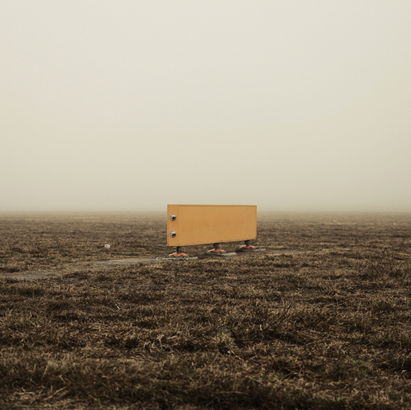
Matthias Heiderich Photography - Favourite Places 2

Some great photography work from Matthias Heiderich called Favourite Places... 

Matthias Heiderich Photography - Favourite Places 1

Matthias Heiderich Photography - Favourite Places 2

Matthias Heiderich Photography - Favourite Places 3

Matthias Heiderich Photography - Favourite Places 4

Matthias Heiderich Photography - Favourite Places 5

Matthias Heiderich Photography - Favourite Places 6


Favourite Places 2: Tempelhofer Feld on the Behance Network

Why you love being a Graphic Designer! (NOT)

Why you love being a Graphic Designer! (NOT)

Must see movies

Must see movies

Watched 2 amazing movies this week:

In to the wild - No idea why I haven't seen it before, it's quite long but I like that, 5 out of 5 really worth a view if you get the chance

Terri -
Amazing film, slow to start but that's needed for the film to build pace, not really a comedy as mentioned although I chuckled over a few parts, the lighting and music pays a major part in the film, it was really well thought out, another 5 out of 5

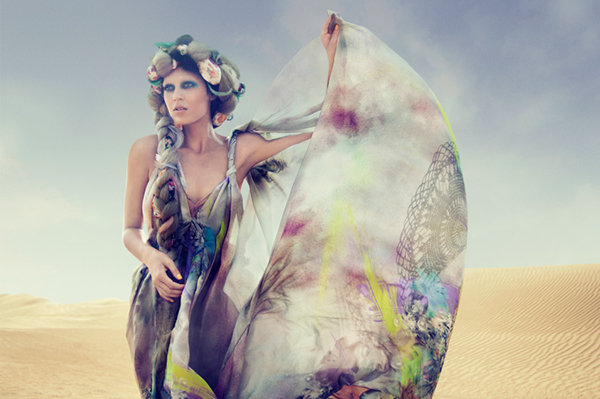
Chrystel Plischke-Livolsi Photography - Desert flower

Photographer: Susanne Spiel
Make up & Hair: Sophie Anntherese
Stylist: Chrystel Plischke-Livolsi
Assistant stylist: Pearl- Mareva Hippolyte
Location & production: Chrystel Plischke-Livolsi

Chrystel Plischke-Livolsi Photography - Desert flower 1

Chrystel Plischke-Livolsi Photography - Desert flower 2

Chrystel Plischke-Livolsi Photography - Desert flower 3

Chrystel Plischke-Livolsi Photography - Desert flower 4

Chrystel Plischke-Livolsi Photography - Desert flower 5

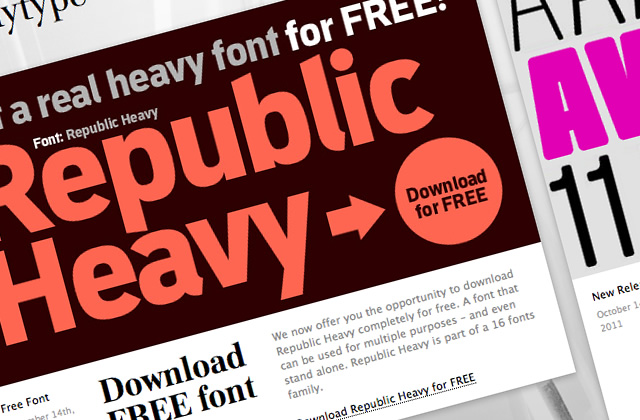
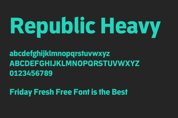
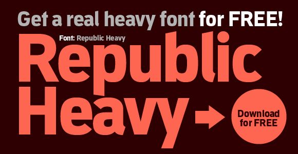
FREE FONT: Republic Heavy

FREE FONT: Republic Heavy - great for headlines

FREE FONT: Republic Heavy 1

FREE FONT: Republic Heavy 2

FREE FONT: Republic Heavy 3

FREE FONT: Republic Heavy

© all rights reserved
made with by templateszoo